
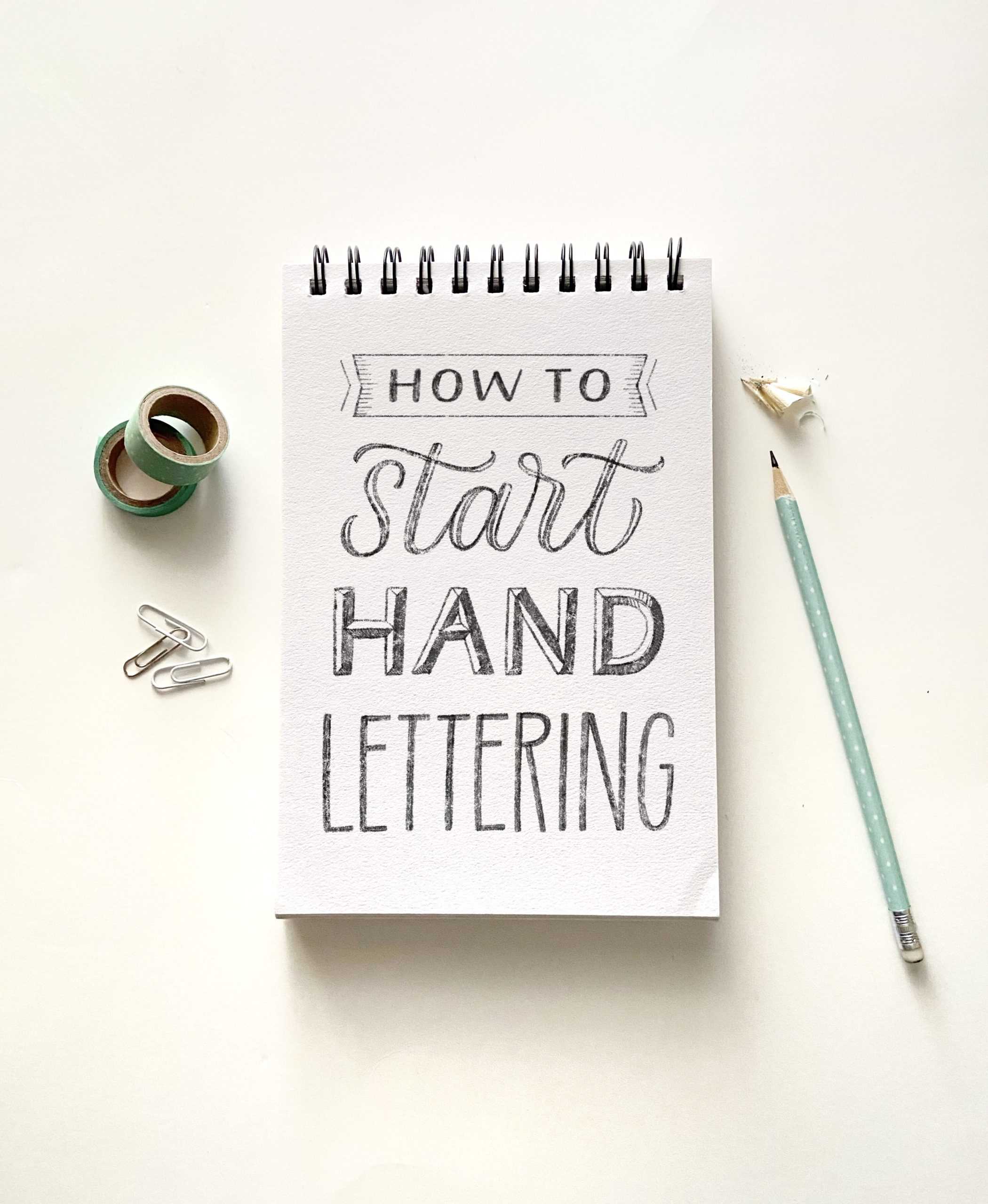
How to Start Hand Lettering: Simple Beginner’s Guide
You’ve seen hand lettering before, you love how it looks, and you’re ready to try doing it yourself. But where do you start?
I’ve written this beginner hand lettering guide just for you, and I’ve kept it simple while still giving you all you need to get started… because hand lettering doesn’t have to be complicated!
Want to learn with a step-by-step online course? Stefan Kunz has an Ultimate Hand Lettering Course where he teaches you how to create incredible hand lettering art, even if you’re a complete newbie. Use the code HEIDI25 for 25% off!
This post contains affiliate links. Learn more.
What is hand lettering?
Hand lettering is the art of drawing letters. Take any tool, draw some letters in any style, and you’ve just done hand lettering.
Yep, that’s all there is to it!
Hand lettering can be as simple as that, or it can be as complex as 3D beveled letters with shadows. There’s not a right or wrong way.
Hand lettering is an art form that doesn’t require any special tools or knowledge. Anyone can do it!
Many lettering artists are self-taught because of this. They just started drawing letters one day and kept learning from there.
That’s really all it takes for you to learn hand lettering: a desire to learn, and the willingness to keep practicing!
Hand lettering vs lettering, calligraphy, or fonts
What about hand lettering compared to the terms “lettering” or “calligraphy?”
There are various lettering and calligraphy terms you’ll see people use, and they’re not always used correctly.
Many of the “hand lettering” articles online are actually teaching modern calligraphy, not hand lettering.
It’s okay if you don’t know or use the correct terms, but I just want to clear some of it up so you understand the definitions!
- Lettering: “Written or printed words.” It’s a general term that encompasses any kind of words or lettering (hand lettering, calligraphy, fonts).
- Calligraphy: “Beautiful writing.” Calligraphy is the art of writing letters with a pressure-sensitive tool, like a brush pen or pointed pen. Letters are made up of a series of practiced strokes, called “basic strokes.”
- Hand lettering: “The art of drawing letters.” Hand lettering artists draw and illustrate letters in any style using any tool, instead of writing or typing them.
- Handwriting: “Writing with a pen or pencil.” Everyday handwriting is usually quick, functional writing that’s used to communicate or record something.
- Fonts/typefaces: Sets of digital, typed characters in a specific style or font family. (Hand lettering may look like fonts even though it isn’t.)
Want to learn calligraphy instead? Here’s how to start doing calligraphy in 6 steps (video tutorial included!)

Related read: Calligraphy vs Hand Lettering: Why They’re Not The Same
Examples of hand lettering
Let’s look at some examples of hand lettering so you can see a sampling of different letter styles and possibilities!
There are a lot of lettering artists on Instagram, so I picked a few of my favorite posts to show you.
First, here’s a piece by Selina of @letteredinlovecreations. Notice that she used a Sharpie marker for this piece (no fancy supplies needed!).
There are at least eight different letter styles here, which makes for a very interesting design, especially with some added elements like shadows and banners.
Below are four different versions of the same quote by @stefankunz. You can see how many variations are possible with just one phrase!
There are also more complex techniques like 3D curved letters, shadows, and banners that really make the designs stand out.
(Check out his hand lettering course here.)
Here’s another lettering artist, @oraarts, who uses details like shadows, highlights, dots, and stars to add emphasis and make the lettering stand out.
You can be sure it takes a lot of time and practice to create pieces like this, but the finished result is so impressive!
Don’t get overwhelmed, though! Hand lettering can be simple, too.
Like this lettering by @fearfullymadecreations. She drew simple serif letters along with a script word in the middle (drawn and filled in to look like calligraphy).
It’s not complicated, but it’s still so pretty!
Hand lettering can also be as simple as outlining letter shapes and filling them in.
Here’s an example of that by @junebug.doodles_ where the letters are outlined with a black pen and filled in with colorful markers.
I’m feeling inspired to do some hand lettering now, aren’t you?
The possibilities are really endless with this art form and it’s so easy to pick up a pencil and start.

Hand Lettering Workshop
In this video workshop, you’ll learn how to…
- Create unique lettering styles with your everyday handwriting
- Plan and sketch a lettering design
- Complete a beautiful, finished piece of hand lettering art!
Tools and supplies for lettering beginners
You don’t need any special supplies to start hand lettering. Start with a piece of paper and a pencil or pen and use what you have!
If you want to buy supplies, here’s a list of hand lettering tools with some links:
- Ruler for drawing guidelines. Any kind will work.
- Pencil. It doesn’t matter which pencil you use. Experiment with harder or softer pencils if you’d like.
- Eraser. Use any eraser you have. I often like using kneaded erasers, but you’ll probably also want a firm eraser.
- Paper. Printer paper or drawing paper works great. If you don’t like making guidelines, grid paper is very useful for drawing neat letters. Thick paper like mixed media or Bristol is great for final pieces.
- Tracing paper. Really handy for doing multiple drafts of lettering work.
- Fine liner pens. A set of fine liner pens in varying sizes is useful for outlining and drawing letters in ink, especially small details.
- Markers for filling in larger areas. Any kind will work – there are so many out there! Colorful markers are fun to have, or a set of brush pens.
- White gel pens are great for adding details over inked lettering.
There are lots of supplies you could try, but there’s no need to get them all at once. Start with the basics!
Alternatively, you can use an iPad and Apple Pencil if you prefer working digitally. A program like Procreate is great for doing lettering and other art.
If you use Procreate, turn on the drawing guide and set it to a grid to use as guidelines.
The basic lettering styles
The lettering style possibilities are endless, as you saw in the examples above. But let’s look at the most basic styles and their characteristics.
The three basic lettering styles are sans serif, serif, and script. There are many variations, but these are all you really need to know to get started.
I’ll show you some examples of each of these.
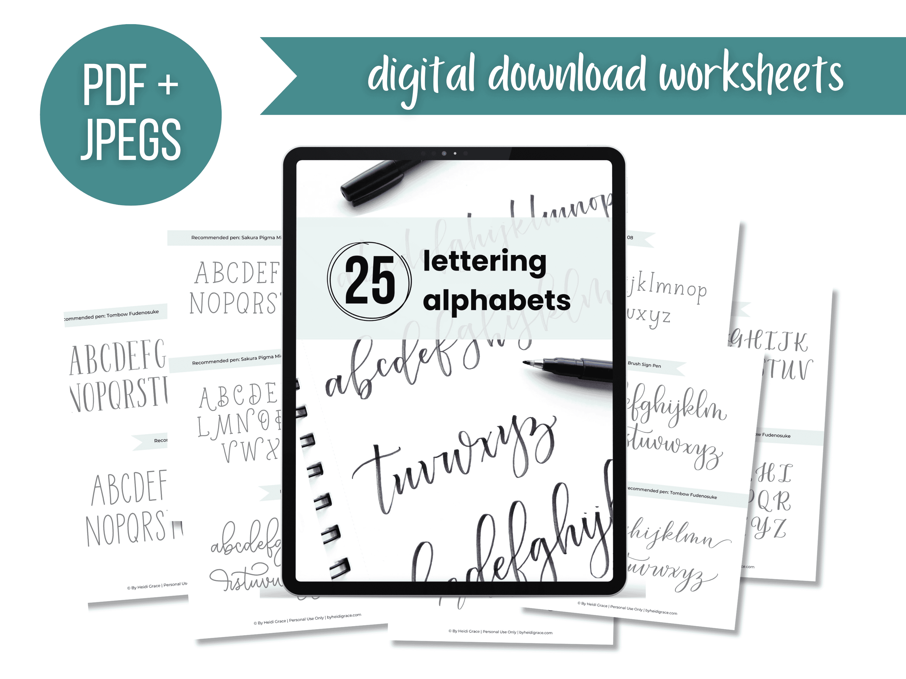
25 Hand Lettering & Calligraphy Styles
Need some hand lettering inspo? Grab these printable worksheets for 25 different lettering styles you can use for all your projects!
Serif
Serif letters have small lines called “serifs” attached to some of the ends.
There are many different styles and variations of serifs. They can be thin, thick, rounded, or squared.
Here are some examples:
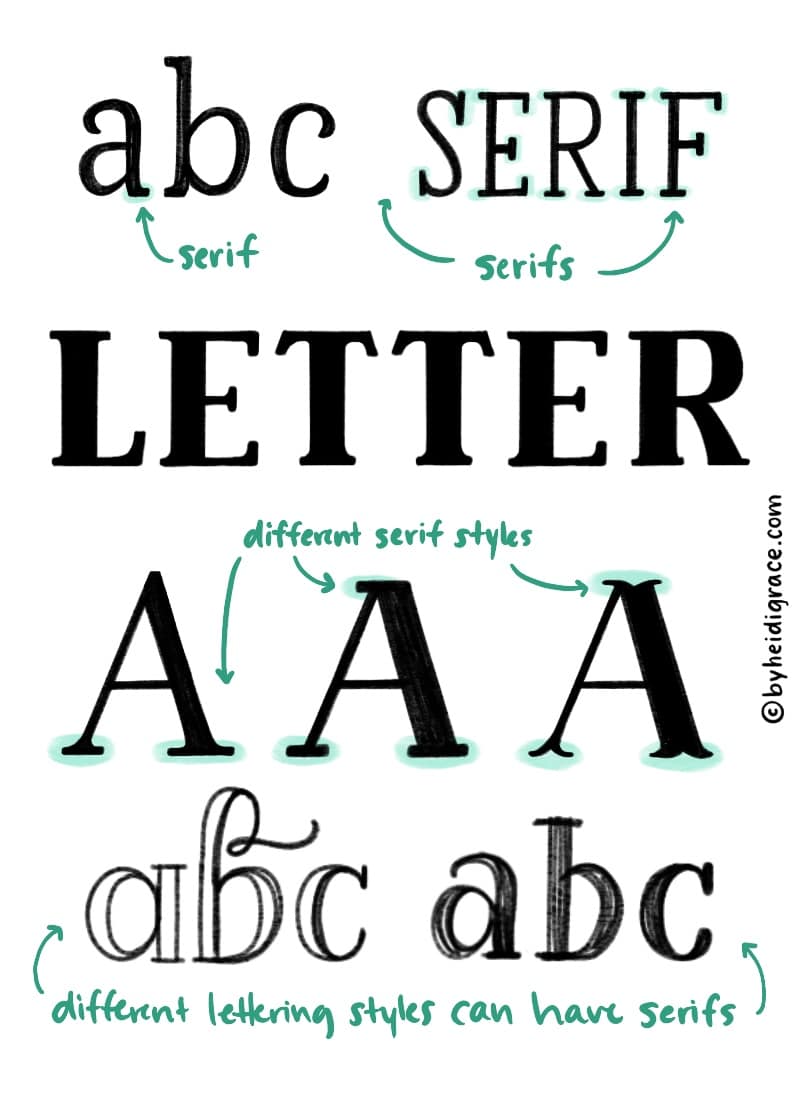
It takes practice to remember where to put serifs (and where not to put them) on different letters.
If you’re drawing serif letters and you aren’t sure where to put the serifs, just look at a serif font.
A website like fonts.com will have lots of different fonts that you could practice with and get ideas from.
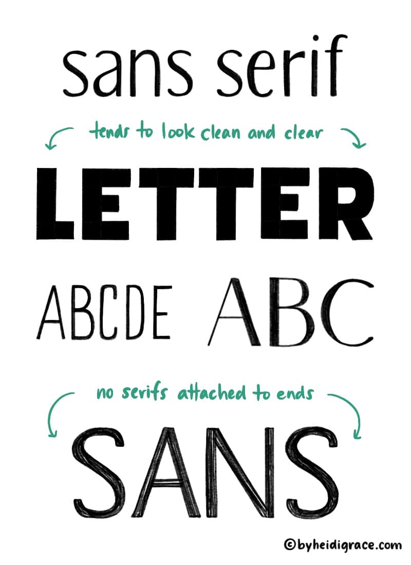
Sans serif
A sans serif style has letters without serifs attached.
Sans serif lettering styles look clean and easily readable because of this.
It’s also the easiest style to start drawing because it can be so simple!
Here are some examples of sans serif letters:
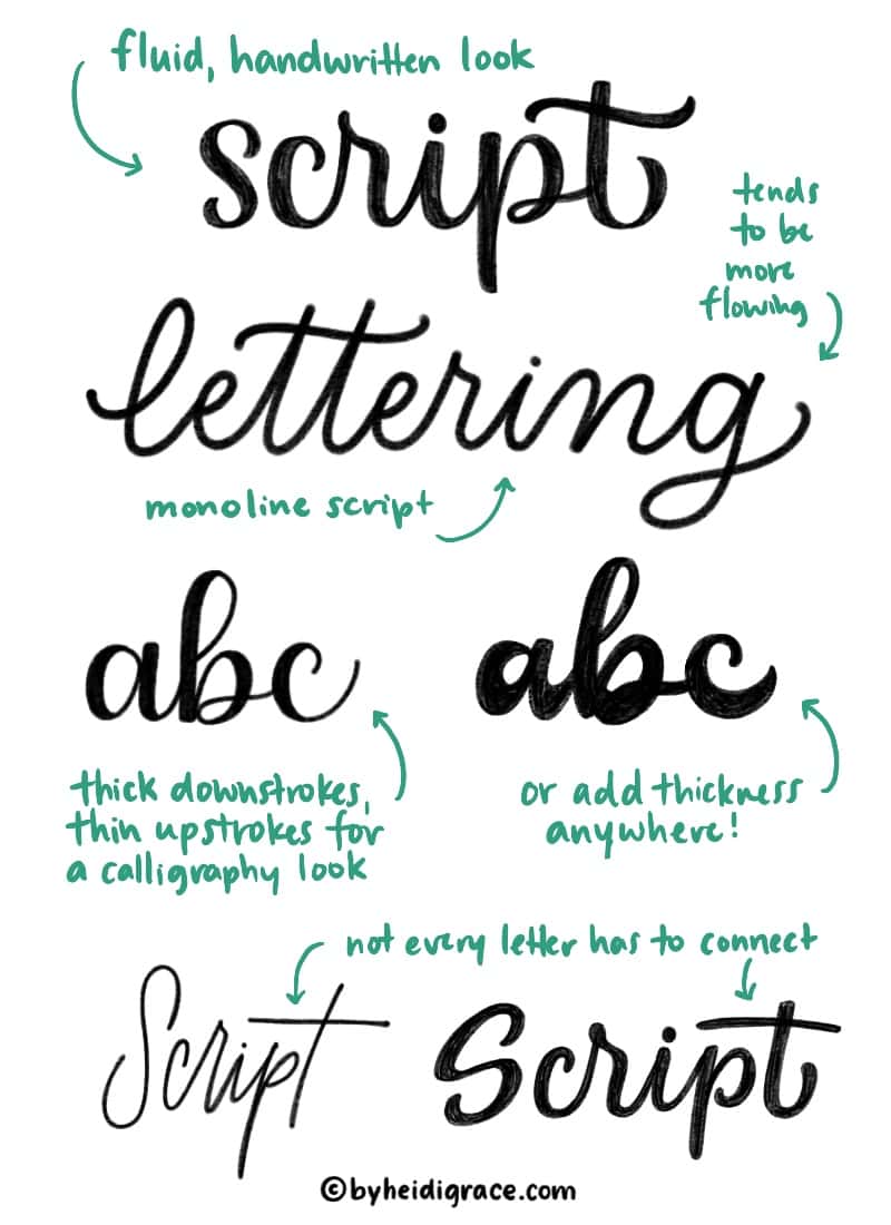
Script
Script lettering is connected, cursive-like lettering.
It tends to be more fluid and expressive than the other styles.
If you learned cursive or calligraphy already, script will be easier for you to pick up!
Here are some examples of script letters:
Practice tip
To practice drawing lettering styles, type out the alphabet using different fonts and print out the pages. Trace over the letters multiple times to learn the shapes and where to add thickness or serifs. Try it with script, serif, and sans serif fonts.
Other styles
There are also many lettering styles that don’t necessarily belong in one of these three basic categories.
Other illustrative lettering styles could be called creative lettering or decorative lettering.
For example, you could draw letters made out of objects (e.g. leaves, pencils), or letters that look like something else (e.g. a neon sign, ribbon).
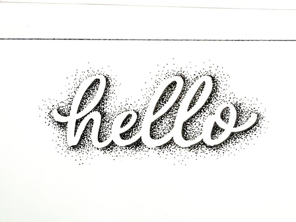
(Find the tutorial for this dot lettering style here.)
The great thing about hand lettering is that you can be as creative as you want – there are no real rules!
You can mix and match styles to come up with your own unique version.
Letter terminology and structure
Learning hand lettering means diving into the fascinating world of letters!
Here are some lettering terms and guidelines that you should know before we start
Lettering guideline setup
Take a look at the example below to see how lettering guidelines are generally set up and how letters rest on them.
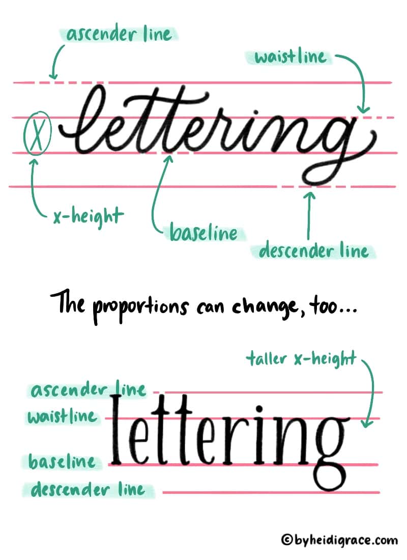
Try using a ruler to draw a set of guidelines for yourself and labeling them.
You could also add angle lines, to help keep the letters at a consistent angle.
Basic anatomy of letters
There are a lot of really specific terms that are used for type anatomy, but there’s no need to get deep into those.
For now, I’ll show you some basic lettering anatomy terms that you may need to know.

Here’s the list of terms and what they mean:
- Ascender: The part of a letter that extends above the waistline/x-height.
- Descender: The part of a letter that extends below the baseline.
- Tail: A term for the descending strokes of letters like g, y, and p.
- Bowl: That round/elliptical shape that makes up letters like a, b, d.
- Stem: Main straight line of letters like n, d, t.
- Serif: A stroke attached to the ends of some letters.
- Crossbar: Line that crosses letters like A or t.
- Leg: Term for that downward-extending stroke in letters like k or R.
- Loop: Any descender/ascender loop that’s part of letters like g, h, f, etc.
- Ligature: A term for when you combine two letters with a connecting stroke, making them essentially one character.
- Flourish: Those swirly, decorative strokes that can be added to (or around) letters.
There’s no need to memorize or even use all of these terms. (I don’t!)
It’s just handy to know what some of the different parts of letters are called.
How to build letters
There are a few ways you can draw and construct letters:
- Outline the entire letter
- Start with a “skeleton” frame
- Build the letter in sections
Here are examples of each of those three methods:
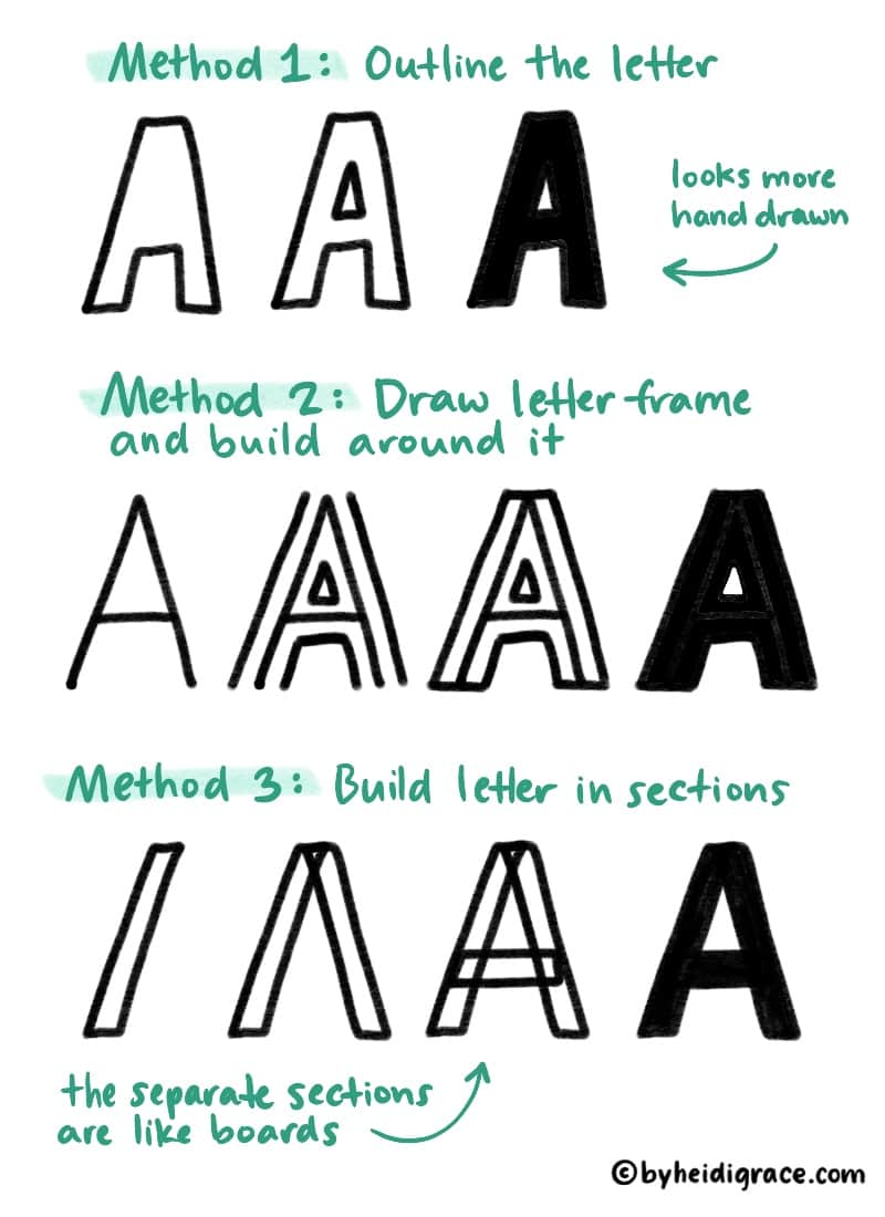
There’s no right or wrong way, so play around and use whatever method you want.
Need some printable lettering worksheets?
Grab my 25 Lettering Styles worksheets that you can start practicing with TODAY. Just pick from a collection of different alphabets and start tracing. Lettering guide sheets included!
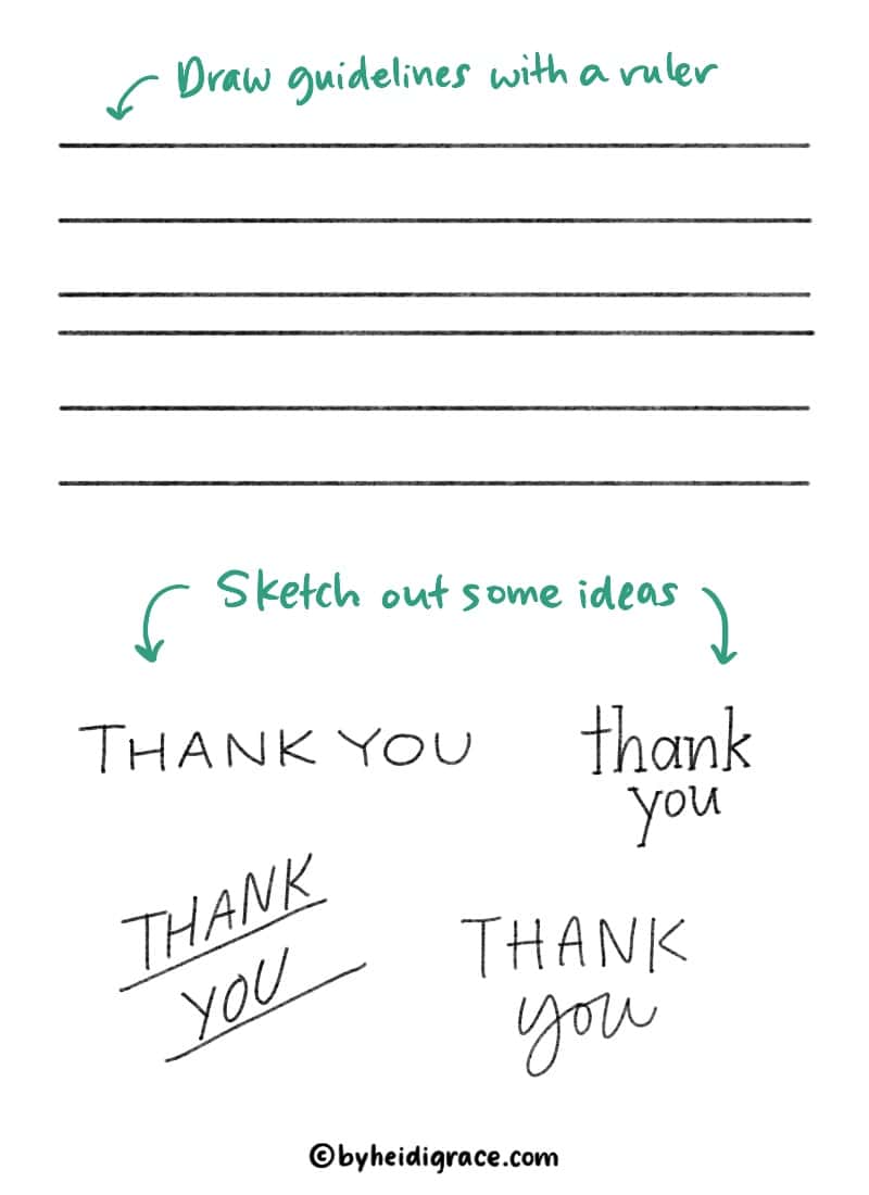
How to start hand lettering
Let’s start hand lettering!
Grab a pencil and paper and follow the steps below to create your first piece.
Keep it simple and start with just a word or two. As you practice, you can start doing longer and more detailed pieces.
Time needed: 20 minutes
Here are step by step instructions for how to start hand lettering.
- Choose a style.
Pick a lettering style that fits the piece you want to create. The options are endless, but start with just with one or two. Sans serif block letters are nice and simple.

- Start with a sketch.
Use a ruler to draw guidelines for yourself if you don’t have lined paper. Roughly sketch out your idea(s) in pencil beforehand if you’d like.
- Draw and build up the letters.
Use the method you prefer to draw the letters, whether it’s outlining, starting with letter frames, or constructing in sections.

- Refine.
Once you’ve drawn the letters, you can refine and adjust them. Pay attention to things like consistent width and spacing.
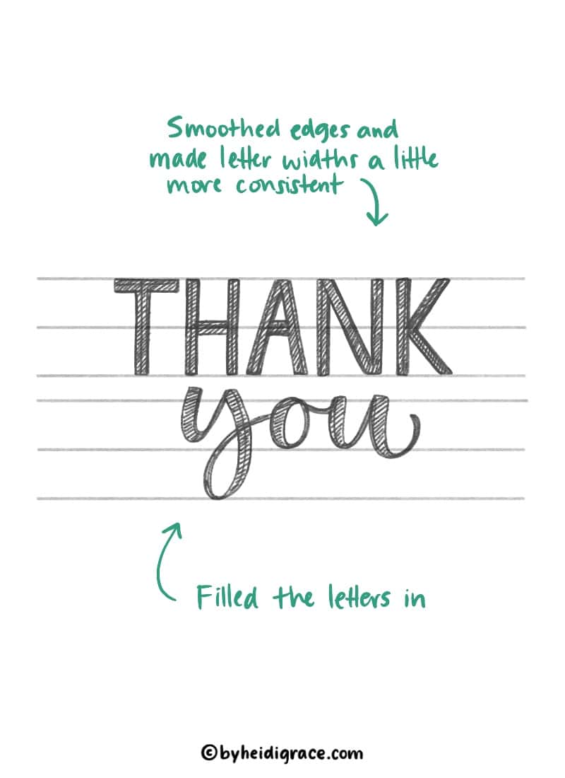
- Complete in ink.
Go over your penciled lettering design with a fineliner or other pen. Trace it onto a fresh piece of paper if you’d like.

- Add extra details (optional)
Now is the time to add extra details like shadows, outlines, inlines, or other embellishments to the letters.
Once the ink is dry, you can erase the guidelines and admire your finished work!
Congratulations! You just created your first hand lettering piece!
If you’re not satisfied, you can start over and make changes.
If you’re wondering how to add more details to make your lettering extra special, check out this post: 21 Easy Ways to Embellish Hand Lettering
Practicing and finding inspiration
One of the best ways to practice hand lettering is to find inspiration around you (or online) and try to replicate the styles that you see.
Fonts and hand lettering are all around you on packaging, signs, mail, book covers, etc.
Two great places to find lettering inspiration online are Instagram and Pinterest.
(For more ideas, check out this post: 7 Great Places to Find Lettering Inspiration)
Start paying attention to the letters you see and think about how you could recreate them.
Practice tip
Look around you and find a font or lettering style that you want to try replicating. Start sketching with a pencil (or you could trace) to figure out how to draw the letters yourself. Or take the idea and put your own twist on it!
Here are some things to think about when you’re looking at lettering ideas:
- Where is the weight (thickness) added, if at all? How much contrast is there between thin and thick lines?
- What colors are used?
- Is a serif, sans serif, or script style used? Or is it more of a creative or decorative style?
- Notice how a lettering style can change the whole appearance and feel of a word.
- What details are added to make the words stand out? (Flourishes, shadows, etc.)
- How would I draw this style?
- What do I like best about it?
For the purposes of practice, it’s ok to replicate lettering that you see online and want to try. That will help you learn new lettering techniques and styles.
(Just give credit to the original artist if you post it online.)
As you practice hand lettering, there are several things to pay attention to and work toward:
- Consistent spacing
- Consistent angles
- Letter sizes
- Legibility
- Consistent line widths
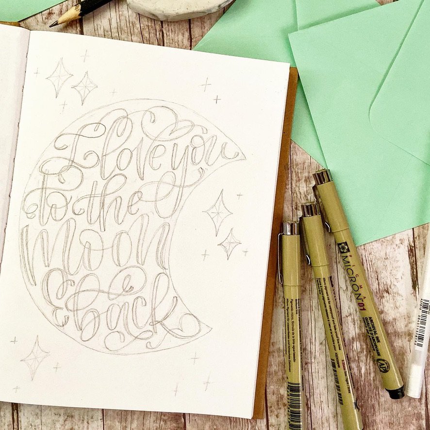
It’s always a good idea to start with a pencil sketch so you can figure out a concept and make adjustments.
A pencil, eraser, and tracing paper are some of my favorite lettering tools.
For more, read this post: 16 Hand Lettering Practice Tips That Actually Make a Difference
More resources for learning hand lettering
Here are some more resources to check out:
- The Ultimate Lettering Course by Stefan Kunz. A great online course that takes you from the basics of building letters to designing impressive compositions! Use my code HEIDI25 for a 25% discount.
- Skillshare classes. Skillshare is an online course platform that has classes on many different topics. There are a whole bunch of classes on hand lettering and calligraphy there, so you can learn a ton from a variety of lettering artists. You can get your first month free!
- Hand lettering workbook by Oraarts. Workbook for beginners that teaches you how to draw several different letter styles, along with some layout practice.
You can also browse hand lettering posts here on my blog!
Final thoughts
There is so much you can do with hand lettering – you could decorate envelopes, make your own cards, do lettering on signs or just about any surface.
For more ideas, check out this post: Creative Ways To Use Your Hand Lettering (15 Project Ideas)
Nothing drawn by hand will be perfect, and that’s what makes it special.
And, the cool thing is, there are no “rules” of hand lettering that you have to follow.
So I encourage you to experiment and play with different styles and ways of drawing letters.
Expand your skills over time instead of trying to learn everything at once. Put the date on your work and later on you’ll look back and see the progress you’ve made!
Save this guide so you can come back to it if you need to ⬇️
ok, thank you
I really loved reading your blog post – when I put in hand lettering honestly it’s always calligraphy and I find that quiet hard to find actual learning guides, how to actually draw the letters. So thank you 🙂
Yay! I’m so glad you enjoyed the post Lisa!
I would love this so much! I have a lot of time now being on disability I want to be able to make bows for my girls, etc.. Thank you for your time.
Hope you give it a try!