5 Mistakes Most People Make with Lettering Compositions
I’ve been looking back on some of my old lettering work from when I was learning composition… and being reminded of how many mistakes I was making.
While it’s all part of the learning process, you can also progress faster and avoid unnecessary mistakes if you know what to watch out for.
Here are some common lettering composition mistakes and how to fix them so you can make your work stand out from the rest!
And hey, why not use some of my old work as examples? (Sorry, old self.)
1. Low legibility
It’s easy to get so caught up in all the elements of a composition that you forget to make sure the words are easily readable.
Different things contribute to low legibility (including most of the other mistakes in this list). Here are some things that can make a composition hard to read:
- Flourishes that look like other letters
- Bad spacing
- Inconsistent angles
- Inconsistent letter sizes
- Flourishes that distract from words
- Letter baselines being too varied
Try not to sacrifice legibility for filling in all the spaces in a composition, even though it’s tempting. With some work, you can figure out how to fill in spaces and keep the words easy to read.
Even if you think your lettering is readable, someone else might not think so because they don’t already know what it says (like you do). If in doubt, run it by another person for their input.
For tips on making your lettering more consistent and legible as you practice, read this post: 3 Calligraphy Tips to Instantly Improve Consistency
Making sure your lettering is readable is super important, and I still have to remind myself of this!
2. Overcrowding
When a composition is packed full of everything without enough space in between, it just looks busy and chaotic.
The reason behind an overcrowded composition is usually trying to fill in all the spaces. Remember that negative space can be your friend!
It’s easier on our eyes to move through a well-spaced composition than it is to look at a busy design that has too much competing for attention.
This mistake is partly caused by improper spacing. It’s important to give each element plenty of breathing room. Do your best to ensure that each word, line, banner, and flourish isn’t too close to any of the others.
Quick Tip
Try giving yourself a set amount of space to leave between composition elements, such as the width of a downstroke.
Another cause of this mistake is trying to put too much into one composition.
Avoid adding too many embellishments, flourishes, or styles to a design. If you do add them, just make sure they serve a purpose and look balanced.
In the end, you should try to keep the focus on the words and not everything around it. So make sure the words have room to stand out and be read clearly!
3. Stretching script letters too far
When writing in lowercase script letters, you often end up with gaps because ascenders and descenders (like h and y) extend higher or lower than x-height letters (like e and c).
(By the way, “script” just means the letters are connected, like cursive.)
You can often use flourishes to fill in the spaces, but sometimes the letters don’t work well for that.
One way that some artists get around the resulting gaps is to make all the letters the same height. They stretch out letters to make an almost-solid line of lettering.
Here’s an example to show you what I mean:

This is something I used to do and that I see others do all the time, too.
It works, since the lowercase letters now fill in most gaps, but you risk losing legibility.
When you don’t differentiate the heights of various letters, they start looking like other letters. For example, a lowercase script “l” looks like an “e” when the two are almost the same height.
It can also cause a composition to look too “heavy” or busy, making it a lot for our eyes to sort through. That’s what it feels like when I look at this old piece of mine below.

Important note: If this is already your style of lettering, you don’t have to change it! It can be a cute style. Just be careful of readability.
Instead of stretching out all the letters, fill the space another way by adding an embellishment or changing styles.
An uppercase alphabet in any style, or a mixed-style alphabet that combines uppercase and lowercase letters would both fill in space more completely than all lowercase letters.
You could also do bounce lettering (my favorite!) where you “bounce” the letters to fill in spaces better, instead of writing them on a straight baseline.
Here’s an article by Loveleigh Loops about bounce lettering for beginners.
So if you can’t get rid of awkward gaps caused by ascender and descender letters, try switching to a different style for those words.
Don’t just make all the letters the same height or it’ll get confusing to read.
If you do decide to use a mixed-style alphabet or something similar, be strategic about the letters you use and put readability first!
4. Too much empty space
While ample spacing between elements in a composition is important, obvious empty gaps can also take away from a design (unless they serve a purpose).
When a composition has big, awkward empty spaces, it just makes it obvious that the layout wasn’t planned too well!
There are a few ways you can fix this:
- Rearrange the words/lines to eliminate empty areas
- Change lettering styles to fill in gaps better
- Fill in empty spaces with flourishes or other embellishments
Sometime switching up styles or how a sentence is broken into lines is all that’s needed to fill in an awkward empty space.
If there’s not a good way to do that, flourishes or little doodles are perfect for filling in gaps. Just make sure to keep it balanced and that it ties in with the rest of the piece.
Quick Tip
When adding an embellishment or flourish, try to add something similar in another area. This makes the composition more balanced and helps the eye to not focus too much on one thing.
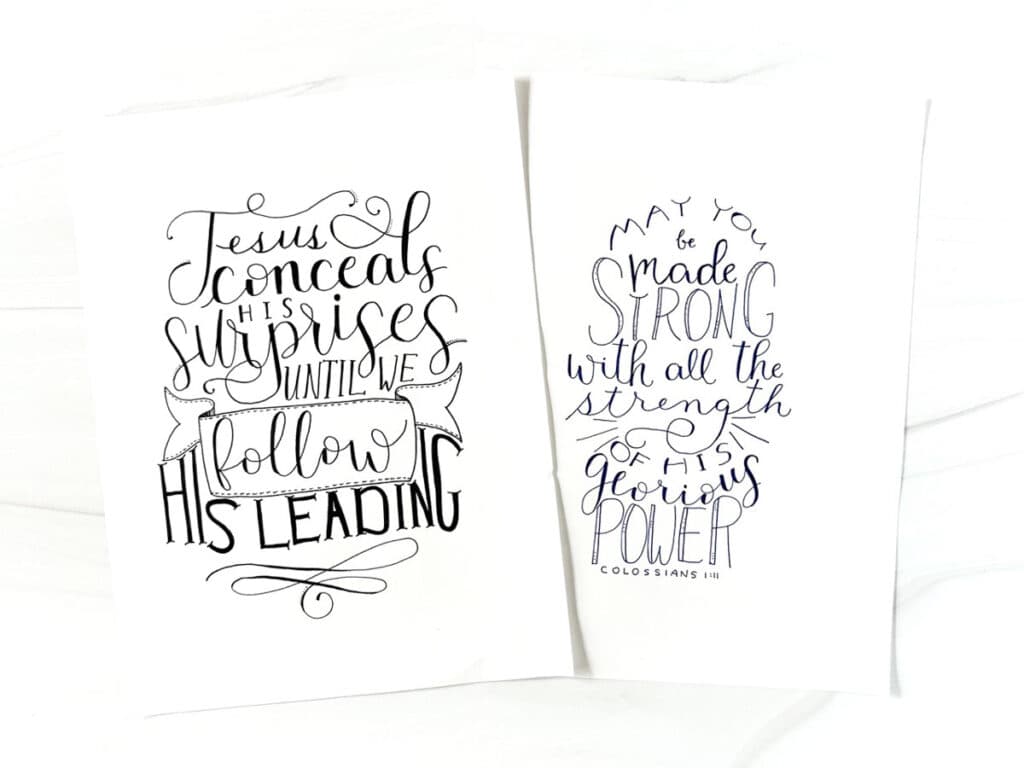
5. Distracting flourishes
Another mistake I see in lettering compositions is flourishing that distracts from the words. (I’ve totally been guilty of this one. Flourishing is fun!)
Flourishing is a great way to fill in empty spaces, but don’t overdo it. Too much flourishing can look like a tangled mess!
Here’s an example from one of my old pieces:

It was an assignment for a course I was taking, and the first one was supposed to be “minimal flourishing” and the second one “full flourishing.”
At the time, I didn’t even realize it, but now I look at it and think, whoa! Too much.
In addition to the amount of flourishing, the direction of the flourishes can be another problem.
A flourish that swirls around and finishes with the end pointing away from the words will also draw our eyes away from the words, and that’s not the goal!
Make sure that the “tail” of each flourish points back toward the rest of the composition and not away from it.
Flourishing is an art that takes practice. It can be hard to know when to add more or when to stop.
Showing your composition to someone else (preferably someone who will be constructive in their criticism) is probably the best way to get a fresh perspective.
Taking a picture of your work can also help you see issues you didn’t notice before.
If you’re not sure whether some flourishes are too much, maybe just remove them and put readability before the decoration!
While I love flourishing, I often end up leaving most of it out and keeping the design simple.
Final thoughts
Lettering compositions take time to master, so don’t be hard on yourself if you realize you’ve been making some of these mistakes. Work on one thing at a time!
One of the best ways to practice composition is with a pencil and tracing paper so you can easily make revisions.
Make notes about what you want to change, and if you start making too many drafts of the same design, put it away to look at later!
If you don’t even know where to start with a composition, read this post: How to Design Lettering Layouts