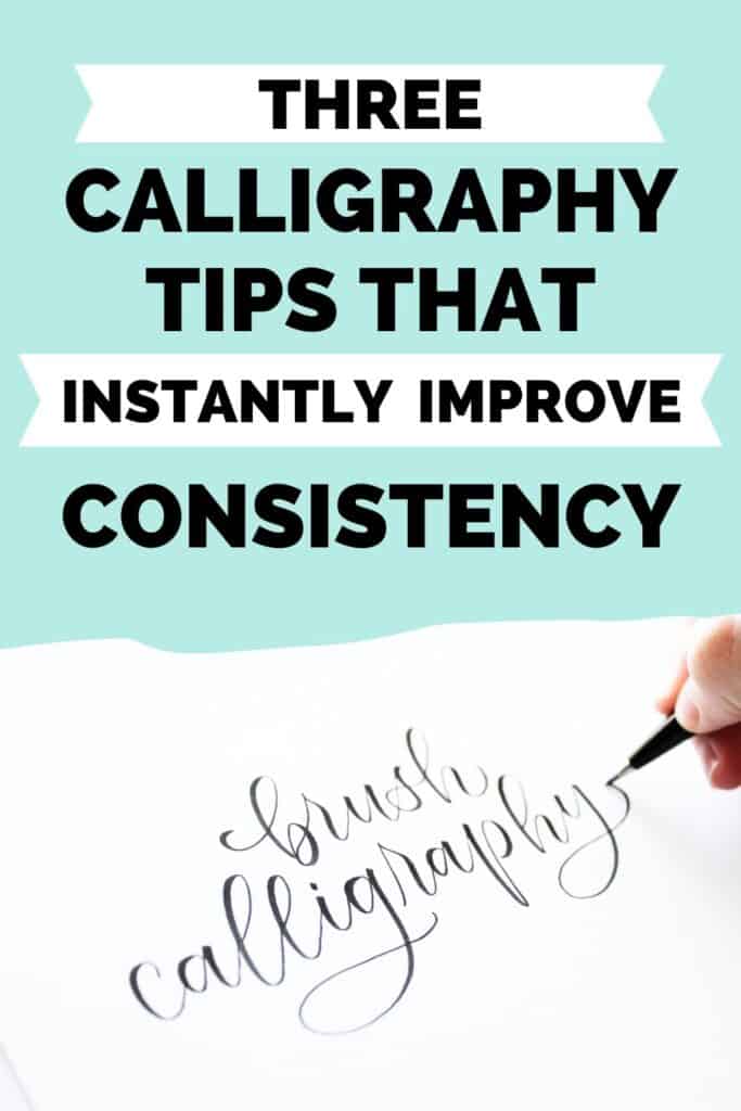
3 Important Things to Check For When Doing Calligraphy
Consistency is the key to beautiful calligraphy.
In this post I’m going to share 3 things to check for so your calligraphy stays neat and consistent, even without guides.

Have you been doing brush calligraphy for a while, but can’t figure out why your work doesn’t look as amazing as you hope?
I understand the frustration, because I had the same problems not too many years ago.
Somehow the beautiful lettering I envisioned in my head didn’t take shape on paper, and I would feel disappointed in the result.
Very often, this is caused by the problem of inconsistent calligraphy.
Why consistency is so important
Consistency makes a huge difference in your brush lettering.
Consistent calligraphy looks neat, cohesive, and beautiful.
It’s easy to read and pleasing to look at because it’s balanced.
Inconsistent calligraphy looks messy and disjointed.
The lettering is all over the place.
Inconsistency can also make your calligraphy hard to read, which we don’t want.
The problem is, it’s really hard to spot this in our own work!
That’s why it’s important to know what to check for when you’re looking at your brush lettering.
Want more calligraphy instruction and support?
Check out my online course that guides you through the basics all the way to creating your own designs, so you’ll be able to do beautiful calligraphy confidently and have more FUN while doing it.
What causes inconsistent calligraphy?
Two big reasons for inconsistent lettering:
- Simply neglecting to pay attention to letters and how they affect a whole word
- Going too fast
When we first learn calligraphy, we typically use guidelines every time.
Then as we get more confident, we stop using guidelines and even get lazy about keeping everything neat.
That’s why it’s important, no matter what level you’re at, to check for inconsistencies that sneak in.
So here are three things to check for so you can keep your calligraphy looking consistently awesome!
(Plus a bonus tip at the end.)
You might also like: 17 Must-Know Calligraphy Practice Tips
1. Even spacing
This one’s a big one.
Always be checking for even spacing between letters.
Inconsistent spacing is one of the most noticeable mistakes because it always makes your calligraphy look “off,” even if you’re not exactly sure what the problem is.
My #1 tip is to keep the exit stroke (connecting line) of each letter the same width so the spacing between each letter is consistent.
Once you get into that habit, you won’t even have to think about it!
Spacing is important for readability, too, since some letters can look like other letters when they’re crowded close together.

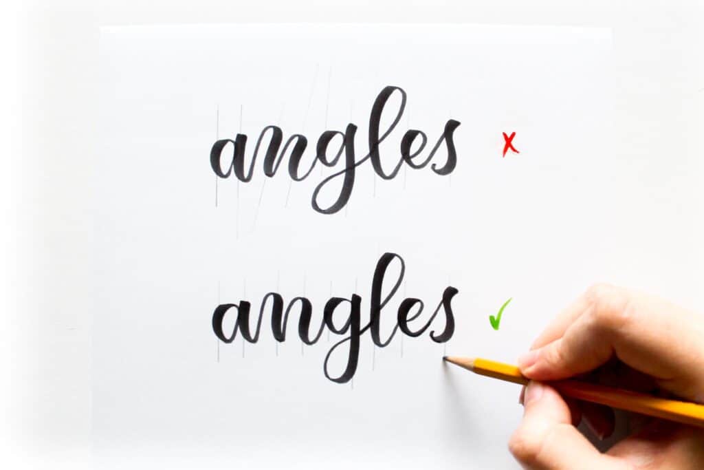
2. Angles
Try to keep each stroke at a consistent angle, whether you’re writing slanted or upright.
It’s easy for your letters to start leaning to one side without you even noticing!
A little bit of angle variation is okay, but it shouldn’t be too much.
Since it’s often easy to miss inconsistent angles, how do you check for them?
There are two easy ways to check.
- Use guideline paper that has angle lines on it. This is especially handy if you’re writing at a slant.
- Take a pencil and draw an extended line through each downstroke (use a ruler if you want to be exact). Each line should be about the same angle. If they cross over each other at any point, you know those letter angles are inconsistent.
(Lettering artist Amanda Arneill taught me that last trick.)
Note: Letters like “s” and “x” are exceptions, since the downstrokes for those letters are meant to be angled differently.
It can be tempting to change up the letter angles on purpose for a playful style, but this will most likely make your calligraphy look messy.
3. Letter and stroke size
This is as simple as it sounds!
Make sure the general sizing of your letters is consistent.
The shapes that build up your letters should be roughly the same size.
I.e. try to keep ascenders and descenders all roughly the same length and the loops and ovals generally the same size.
Of course, with modern calligraphy, we have more freedom and flexibility, so not every loop and circle has to be identical to the other.
It’s totally fine to have a bit of size variation, especially if it’s part of your style!
But we also need to make sure there aren’t letters that are obviously too big or small compared to the rest.

Bonus Tip: Upstroke/Downstroke Size
This bonus tip is related to the previous one, because consistent line width plays a big part in consistent sizing.
You want the thick downstrokes to all be generally the same width, and the same for the thin upstrokes.
As always with calligraphy, there should be a noticeable size difference between upstrokes and downstrokes.
If you apply heavy pressure to your pen on some strokes and not much pressure on others, you’ll end up with inconsistent line widths, so that’s something you’ll want to watch for.
Of course, you can always touch up lines and add a little weight to them if you need to!

To help with this, make sure you get to know the pen you’re using to do calligraphy.
When you buy a new pen, get familiar with it so you know how thick the downstrokes can be and how thin the upstrokes can be.
Related read: Best Brush Pens for Calligraphy Beginners (easiest to use)
There’s no need to barely touch the paper to get the thinnest line possible, or to press the pen to its maximum width if it’s not easy to do while writing.
Just figure out how you can comfortably achieve consistent widths for the strokes.
If a brush pen gets mushy as you write and makes it hard to get thin upstrokes, try rotating the pen occasionally as you write.
The pen tip will be firmer after you turn it, making it easier to get crisp lines.

Even if these things don’t seem to magically transform your calligraphy, look at your writing as a whole and you will see a difference.
Little things like spacing and angles don’t seem that important when you’re working on a word or two, but when it comes to bigger lettering compositions, these things have a big effect.
Making sure letter spacing, angles, and sizes are consistent is what takes your lettering from “meh” to “yay!”
Keep these tips in mind the next time you’re doing brush calligraphy and remember, building muscle memory from regular practice will make it easier to write consistently.
Read this next: How to Get Rid of Messy Transitions in Calligraphy (easy fixes)
Want more calligraphy instruction and support?
Check out my online course that guides you through the basics all the way to creating your own designs, so you’ll be able to do beautiful calligraphy confidently and have more FUN while doing it.