
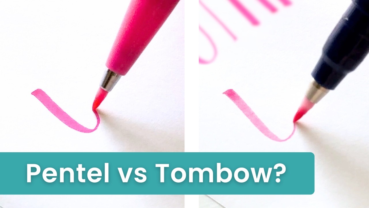
What You Should Know About Pentel Sign vs Tombow Fudenosuke Brush Pens
If you’ve shopped for calligraphy brush pens, I’m sure you’ve run into Pentel Sign Brush pens and Tombow Fudenosuke brush pens.
In this post, I’m going to share an honest comparison of the two and point out some very important differences.
Quick takeaway
If you’re a brush lettering/calligraphy beginner, Tombow Fudenosuke hard tip pens are the best choice for you. They are easier to control, more forgiving for calligraphy, plus they’re better for long-lasting artwork.
If you’re looking for colorful pens with water-soluble ink that you can blend with, Pentel Brush Sign pens are perfect for that. They write smoothly, are fun to use, and have juicy, vibrant ink.
You can watch my comparison of Pentel vs Tombow Fudenosuke brush pens in the video below.
Pentel and Tombow brush pens are very similar but there are some important distinctions that you should be aware of.
That’s what I’m going to share with you in this post!
I have and love using both the Pentels and the Tombows for lettering, so I’ll also share my opinions about which work best for that.
This post contains affiliate links. Learn more.
Pentel Sign vs Tombow Fudenosuke brush pens
Quick list of facts about Pentel Brush Sign Pens:
- Small writing size
- Flexible brush tips
- Available in 24 beautiful colors
- Water-based, richly saturated ink
- Great for brush lettering, calligraphy, or illustration
According to the Pentel website, these pens will not dry out if left uncapped. I haven’t tested this, though.

Quick list of facts about Tombow Fudenosuke brush pens:
- Small writing size
- Flexible brush tips
- Water-based pigment ink
- Available in 10 classic colors, plus neon and pastel colors
- Great for brush lettering, calligraphy, or illustration
One important thing about the Tombow Fudenosuke pens is that they come in two different kinds of brush tips.
There are the hard tips, which are firmer, and the soft tips, which are softer and more flexible.
So just pay attention to what’s included in the set you’re looking at.

Pentel and Tombow pens are both popular for calligraphy, but let’s compare the two a little more closely.
Pen size
As far as pen size goes, Pentel and Tombow pens are pretty much the same.
Both pens have small brush tips and will give you a small writing size.

It does vary slightly because some pens are softer or firmer.
For example, the Tombow Fudenosuke hard tip pens are firmer, so they write a little smaller.
The most noticeable thing to me is that you can get thinner upstrokes with the Tombow Fudenosukes than you can with the Pentels.
This can contribute to writing size, too.
Color comparison
Now for the fun part – colors!
It’s easy to see right away that Pentel Brush Sign pen colors are way more saturated and vibrant than the Tombow Fudenosuke colors.

The Pentel pens are juicy, smooth, and vibrant, while the Tombow pens are drier and less saturated.
The Tombow colors look a little dull when compared to the Pentels.
(BUT there is a reason behind this noticeable difference and I’ll talk about that a little later!)
If you’re mostly concerned about colors, the Pentels are a clear winner in this category.
Ease of use
Next let’s look at ease of use, or how easy is it to use these pens for lettering?
The last thing you want is for a pen to feel frustrating to use or make you feel like your writing is messy.
Here’s my first-hand experience:
The Pentel Brush Sign pens write very smoothly, especially on smooth paper. They feel easy and very enjoyable to use.
But because they’re a little soft, they require more control if you want to keep your writing really crisp and neat.
The hard-tip Tombow Fudenosuke pens are firmer, so they can feel a little stiff after using the Pentels. But once you’re used to that, they write just as easily and smoothly.
And because the tips are crisp and firm, they’re not floppy which makes them much easier to control.


The soft-tip Tombow Fudenosuke pen is very similar to the Pentel pens. Writes soft and smooth, but the slightly floppy tip requires more control for neat lettering.

Related read: Best Paper for Brush Pens: A Complete Guide
Transitioning from thick to thin
Another super important thing to look at is how easy transitions are with each of these pens.
Transitioning smoothly between thick and thin is one of the trickiest things about doing calligraphy and the pen you use is a big factor!
Related read: How to Get Rid of Messy Transitions in Calligraphy (easy fixes)
The differences are subtle, but here is my experience:
The Pentel Brush Sign pens are not the best for smooth transitions. They make it way too easy to “drag” extra weight into thin upstrokes.
You have to be very careful and controlled with the Pentel pens if you want neat, crisp calligraphy.

The hard tip Tombow Fudenosuke pens are much better and more forgiving when it comes to calligraphy transitions.
Because the pen tips are so firm, your lettering will still look pretty crisp and neat even if you go fast or get lazy about controlling the pen.
The hard tip pens almost correct the errors for you, to some extent, which is super cool. (That’s the benefit of pens with firm tips like these!)

The soft tip Tombow Fudenosuke pens are, again, much like the Pentel pens. The softer, slightly floppier tip requires more control if you want smooth transitions.
That said, I love the slightly thicker, bolder look that the soft tips give you.

This seemingly-small issue of transitions is why I only recommend Tombow Fudenosuke hard tip pens to calligraphy beginners.
The firm, crisp tips are much easier to control and are pretty forgiving when you’re doing any kind of lettering.
This makes a huge difference when you’re new to using brush pens!
Blending capabilities and ink permanence
The last thing I want to mention is blending capabilities and ink permanence.
Pentel Sign Brush Pens have what they call “water-soluble” ink.
This means that you can blend the colors with water almost just like watercolor, which is a cool feature with a lot of fun uses!
More on that in this post: 5 Easy Blending Techniques with Water-Based Brush Pens

With the Tombow Fudenosuke pens, you can’t do this.
You might be able to “activate” just a little bit of color with water, but for the most part that ink is staying put.
This is because Tombow Fudenosuke pen ink is pretty much waterproof, or at least very water-resistant.
This is a big advantage for lettering projects that you want to last, or if you’re doing calligraphy on envelopes!
(Pentel does make some pens with a pigment-based, waterproof ink if you want to check those out on Amazon.)

So for ink permanence, the Tombows definitely win.
But for blending possibilities, the Pentel pens win.
If you want to have fun with colorful blending and illustrations, the Pentel pens are for you.
But if you want your lettering to be more permanent and not get damaged by water, then the Tombow Fudenosuke is the best option.
Ink bleed-through
One more thing to be aware of is bleed-through.
Because the Pentel pens are so juicy and the ink is so saturated, they are more likely to bleed through really thin paper, especially if you do a lot of layers.
On the other hand, Tombow Fudenosuke pens are not as “wet,” so you shouldn’t have a problem with bleed through (although the black pens are pretty juicy when brand-new).
If you need a small brush pen to use in a journal with thin paper, I would go with the Tombow Fude pens.
Final takeaway
Both of these pens are great for different purposes and you really have to figure out what is most important to you to make the best decision.
(Or, if you’re like me, just get both!)
If you’re getting started with calligraphy lettering, I suggest starting with the Tombow Fudenosuke pens and then once you get more comfortable, you can try the Pentel pens if you want to.
If you’ve been doing lettering for a while, then it’s really up to your personal preference and what you need the pens for!
Let me know in the comments below whether or not you’ve used these pens and which one is your favorite ⬇️
