
How to Avoid These Common Calligraphy Beginner Mistakes
Want to avoid common calligraphy mistakes so you can make progress faster?
These 10 brush lettering mistakes are ones that beginners often make (myself included), but I’m going to show you how to fix them!
Learn how to do calligraphy in my step by step online course!
I’ll teach you how to do beautiful calligraphy in a calm, easy-to-follow way, with real time video lessons and lots of traceable worksheets.
This post contains affiliate links. Learn more.
1. Not learning how to use a brush pen the right way
This is something that’s easy to miss.
You’re eager to try your hand at calligraphy, so you can buy a brush pen and start writing…
…and then get frustrated because it looks nothing like you thought it would.
The very first step to learning calligraphy, BEFORE you even start learning the strokes, is to learn how to use the pen.
Calligraphy will get so much easier once you actually feel comfortable with using a brush pen!
Fix: Learn how to use a brush pen by watching the video below.

2. Using the wrong paper
This is a beginner mistake that I made myself!
The wrong paper will make your fancy new brush pens fray… fast.
This is because most paper, including regular printer paper and notebook paper, is too rough.

Here’s what you should be using instead:
- Smooth marker paper – like Canson marker paper
- Smooth tracing paper – like Strathmore tracing paper
If you need some thick paper for a project, I recommend using Strathmore Bristol Smooth paper.
Fix: Use smooth marker paper or tracing paper when practicing calligraphy.
You might also like: What I Wish I Had Known as a Calligraphy Beginner
3. Using a brush pen that makes calligraphy more difficult
Not all brush pens are good for calligraphy.
Using the wrong brush pen will make calligraphy so much harder than it needs to be.
Just because you hear about some amazing brush pens doesn’t mean they’re easy to use for brush lettering!
My #1 recommendation for anyone getting started with calligraphy is Tombow Fudenosuke hard tip brush pens.
Why? Because they’re small, firm, and easy to control.
For more info, read this post: Best Brush Pens for Calligraphy Beginners (easiest to use)
Fix: Pick a brush pen that is well-known as easy to use for calligraphy beginners. Avoid big, soft pens.
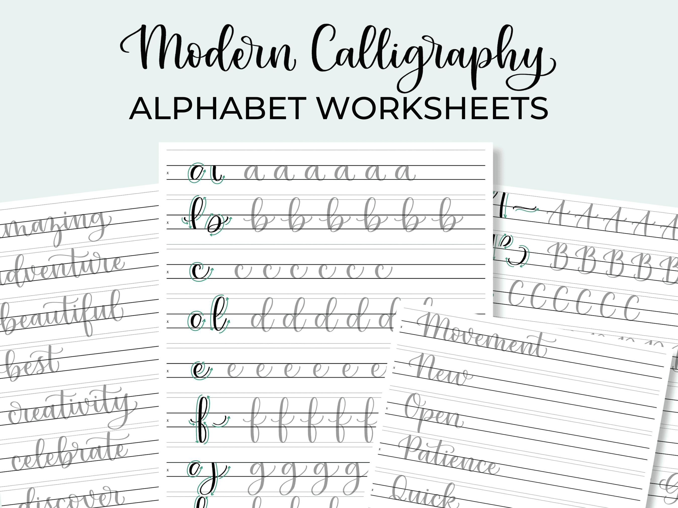
4. Not learning the basic strokes
The basic strokes are the building blocks of calligraphy letters.
Not learning them will really hinder your progress.
Skip practicing the fundamentals and you won’t be very good at the rest, either (sorry, but I had to say it!).
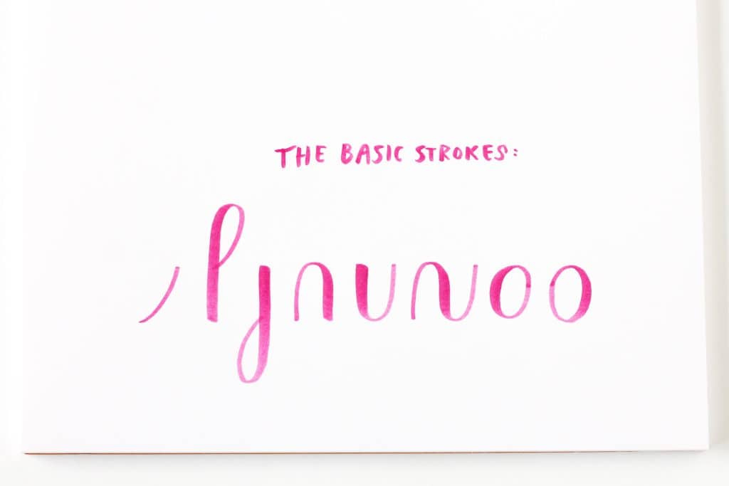
Make sure you take time to learn the basic calligraphy strokes before you start trying to write letters.
Below are some free worksheets if you need them.


FREE basic calligraphy strokes worksheets
Grab these printable worksheets to learn how to use a brush pen and practice the basic calligraphy strokes.
It’s even better if you practice the basic strokes often!
(I’ll be honest though: I didn’t do this when I was learning calligraphy because I didn’t realize how important it was.)
Fix: Learn the basic calligraphy strokes first and practice them a lot.
5. Messy transitions
One of the biggest frustrations for anyone learning calligraphy is rough transitions.
“Transitions” are those areas where you have to transition from a thin line to a thick one (or vice versa).
This is tough because there are lot of things that can go into it.
Things like…
- Going too fast
- Using a brush pen that’s too big and soft
- Holding the brush pen incorrectly
- Lack of practice
You can read an entire post about how to deal with this issue here: How to Get Rid of Messy Transitions in Calligraphy (easy fixes)
But, in short, my best tip for rough transitions is to start adjusting pressure earlier than you think you need to.
When you start adding or lifting pressure earlier, you prepare your hand to respond and make the change in time.
Fix: Start the pressure transition earlier than you think you need to. Lift or increase pressure gradually.
6. Not using guidelines
It’s tempting to skip the guidelines sometimes.
But until you’ve gotten very comfortable with doing calligraphy, guidelines are a must.
Without guidelines, your brush lettering will look inconsistent – probably without you even realizing it.

You can use calligraphy guidelines, lined or grid paper, or draw your own guidelines with a pencil and ruler.
It’s really hard to keep your writing consistent without guidelines!
Fix: Make sure to use calligraphy guidelines or lined/grid paper when practicing.
Find calligraphy worksheets in my shop!
Need help with your brush lettering practice? Check out the worksheets available in my shop for instant download, printable practice sheets.
7. Unfinished letter endings
Leaving lettering endings looking unfinished is a seemingly minor thing.
But it actually makes a BIG difference in how your calligraphy looks.

We tend to let our pen wander after finishing a word if we don’t know what to do next.
The result is straggling, uncertain lines leading the eye away from your lettering, and this seriously detracts from your work.
Fix: Start and end words with a purposeful, curled line. Don’t let your pen wander!
8. Inconsistent spacing
Uneven spacing really makes your brush lettering look “off.”
Sometimes we don’t even realize what’s wrong.

Even spacing can be a challenge, but here’s a simple way to do it.
Make the exit stroke of each letter the a consistent width.
Then, because exit strokes are also the connecting lines between letters, the letters will be spaced pretty evenly apart.
(This will be easier if you’ve practiced your basic strokes!)
Fix: Keep each letter’s exit stroke a consistent width to keep letters spaced evenly apart. Check spacing before you write the next letter.
9. Inconsistent angles
When letter angles are all over the place, it makes your calligraphy look messy.
You can check this by taking a pencil and drawing a line through each of the downstrokes (thick lines).
If at any point those lines cross over each other, the angle is too inconsistent.

Whether you’re writing at a slant or not, try to use calligraphy guidelines with angle lines to keep your letters at the same angle.
It’s also a good idea to keep checking back to make sure you’re writing each letter at the same angle as the others.

Fix: Use guidelines with angle lines on them. Keep checking your letters to make sure you follow the same angle.
10. Going too fast
Going too fast when doing calligraphy is SO easy to do – but it always results in messier writing.
We can’t keep letters neat and consistent when we’re moving too fast, so it’s better to go slow.
Did you know that most of the lettering videos you see online are sped up?
That’s right… calligraphy is actually so slow that it can be boring to watch in real time!
Writing too quickly can often cause other problems like rough transitions and missed strokes.

It can be hard to slow down, but if you focus on each stroke and enjoy the calming, repetitive movements, calligraphy can be a great way to relax.
Fix: Slow down and try to focus on each stroke.
While I hope learning about these common calligraphy mistakes was helpful for you, remember that you don’t have to get everything right the first try.
It’s better to make the mistakes, keep trying, and have fun along the way – because that’s what calligraphy is really all about!

So true! The biggie that you really cannot go back and change is learning stokes first and combining strokes to form letters. I sooo wish that had been the beginning of my journey . . .